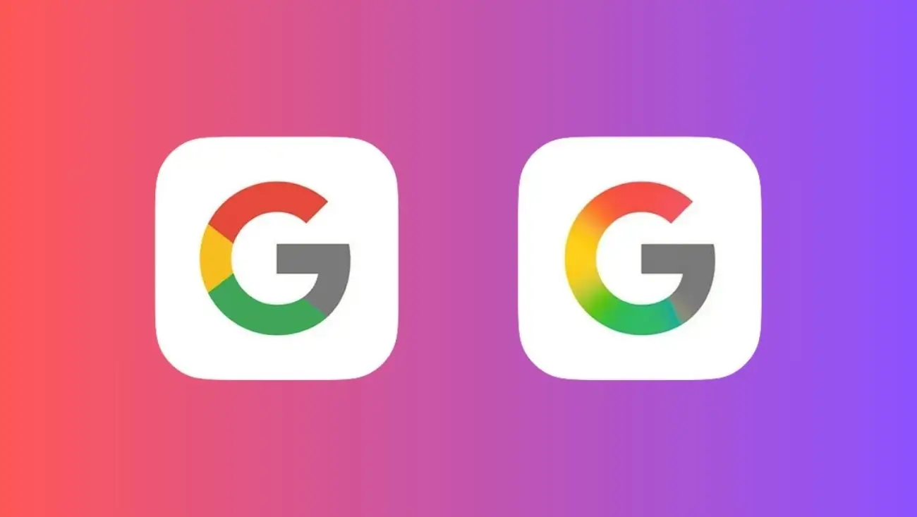
Google has introduced a new gradient design for its iconic “G” logo, marking a significant update after nearly 10 years. This change, part of Google’s broader rebranding efforts, features a blend of the company’s traditional colors—blue, red, yellow, and green—aiming to refresh its visual identity and align with modern design trends. The update, now rolling out to the Google Search app and other core services, has sparked discussions about its impact on user recognition and brand consistency, reflecting broader trends in AI-driven creative tools and digital branding.
The new “G” logo replaces the solid-color version that has been in use since 2015, introducing a gradient that creates a more dynamic and contemporary look. The Verge notes that this design shift is part of Google’s ongoing efforts to modernize its appearance, which began with the 2015 update to the full “Google” logo. CNET reports that the gradient “G” is now appearing on the Google Search app for iOS and Android, with other apps like Gmail and Google Drive expected to follow. This aligns with strategies in AI communication tools, where visual updates enhance user interaction, similar to Google’s advancements in AI caching.
Creative Bloq praises the new logo for its sleek and modern aesthetic, noting that the gradient design resonates with current digital trends favoring fluidity and color transitions. However, Droid Life suggests that the subtle nature of the change might go unnoticed by many users, raising questions about its effectiveness in reinforcing brand identity. This challenge mirrors concerns in AI privacy debates, where small changes can have significant implications for user trust. The update also has implications for third-party developers, as apps relying on Google’s icons may need to update their designs, potentially requiring additional resources, a topic often discussed in cybersecurity contexts.
The digital divide could further complicate the impact of this update. Users less familiar with frequent design changes may struggle to recognize the new logo, a concern often raised in AI accessibility efforts about ensuring equitable tech experiences. Additionally, the gradient “G” reflects Google’s commitment to staying relevant in a competitive market, where visual identity plays a crucial role in user engagement and brand perception.
Google’s gradient makeover of the “G” logo is a symbolic step in its ongoing evolution, aiming to maintain relevance in a digital landscape dominated by innovation. As the company continues to adapt, these design changes highlight the importance of visual identity in user experience and brand strategy. What do you think about Google’s new gradient “G” logo—does it enhance the brand, or is it too subtle to make an impact? Share your thoughts in the comments—we’d love to hear your perspective on this design evolution.


