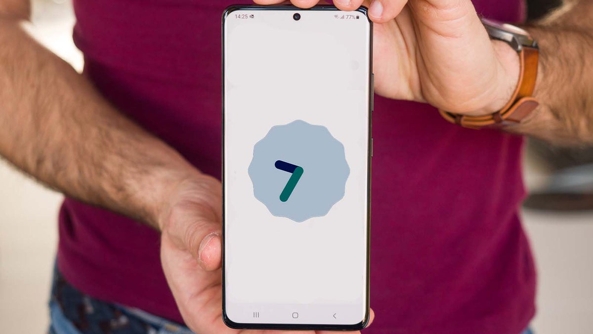

Samsung has once again outdid itself with the latest Android 12 software update slated for its flagship wares. We’ve had to put up with sometimes excruciatingly long waiting times in the past years, but in 2020 and 2021 Samsung showed that it can develop and push software updates quite quickly, just a month or so after the official release of Android to the AOSP channel.
One UI 4: Initial impressions
Starting from the get-go, you wouldn’t notice any immediate and groundbreaking differences between the new and old interfaces, at least at first sight. While the visual differences between stock Android 11 and Android 12 are much starker, Samsung has integrated the novel visual elements in a much subtler way that fits well into the signature design language of One UI. If you’ve been using a Samsung phone in the past couple of years, you will certainly feel right at home with the new interface right off the bat.
Frankly speaking, if I didn’t have another Samsung phone with the older One UI at hand, most of the visual differences would have definitely eluded me. The differences are subtle and implemented so stealthily that you have to know where to look to spot the new additions to the interface. Little to no evidence of Material You, and that’s a good thing! Nobody really expected Samsung to ditch the style it’s been building for a few years and adopt Google’s newfangled visual style, sо the way Android 12’s visual changes were implemented is pretty much perfect from the point of view of a Samsung fan.
Visual novelties aside, One UI 4 is, all things considered, the best interface Samsung has ever come up with… so far. Gone are the days of the garish TouchWiz or the sterile and lifeless Samsung Experience, One UI has gradually evolved into what’s probably the best overall Android skin around, arguably even besting Google’s foundation with stock Android. And rightly so – One UI pairs sufficient customizability while being user-friendly at the same time, and this does not only apply to its current but also previous iterations as well. Certainly a more feature-rich and mature interface than stock Android12, Samsung’s One UI is becoming easier and easier to like.
One UI 4: The new features and the subtle changes
First and foremost, we have the Android 12 theming well integrated within Samsung’s One UI. The ‘Wallpaper’ menu has been upgraded to ‘Wallpaper and style’, and venturing inside lets you change tune up the theme of the phone by changing the color palette. Android 12’s Color Extraction feature has migrated to Samsung’s One UI as well and will gladly extract the main colors of your wallpaper in order to create matching color palettes to apply to your interface. At the end of the day, the wallpaper you choose will have a very big effect on the available color palettes, so don’t flame the interface if it suggests gaudy colors – just try with a different wallpaper!
Now, the color accents aren’t that pervasive and all-encompassing. For what it’s worth, you’ll mostly see the custom colors in the notifications area where your quick toggles and the brightness slider reside. Technically, you can also choose to have your icons themed with the main color from the palette, but it only applies to stock Samsung apps and I’d argue the resulting icons don’t look that good at all. Interestingly, you can’t theme the icons in the main Settings menu, where it also makes sense to have some theming and customization going on.
There’s also the new Android widget selector, which is more intuitive than before and presents the available widgets in a more coherent manner. Now it’s much easier to see what widgets are available for you to put on your homescreen. Speaking of widgets, some of the stock ones are refreshed but the majority are unchanged, for good or bad. From what I can tell, the color palette theming doesn’t work on any of the available widgets, probably because Google’s exclusive Monet theming engine was yet to go open-source at the time Samsung was developing One UI 4.
And finally, an intriguing new feature has made its way to Samsung’s One UI. You know how Apple’s iOS reacts when you reach the end of a list or a long menu? Thanks to a previously-patented rubber band effect, the interface bounces back with a jello-like effect that feels natural and gives you a sense of reaching a certain barrier. As Apple’s tight grasp on this interface element ran out a year ago as the related patent expired, the Android world has no longer been legally prevented from implementing these. Thus, Samsung now has this satisfying overscroll effect in One UI 4. The effect can be found in Google’s and Samsung’s stock apps, like Messages, Contacts, etc, but also works in most of the popular Android apps.
One UI 4: The functionality novelties
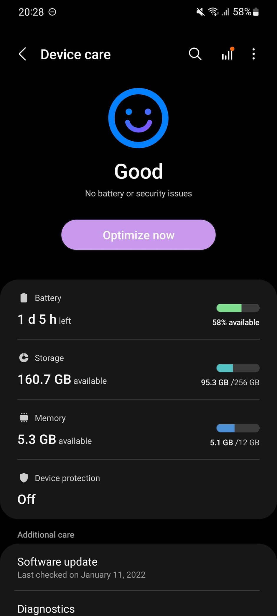
Device care is one of the menus seen the most change. Previously, Samsung represented the state of the device with a percentage, but in One UI 4, this metric has been thrown out of the window and substituted with an… emoji, of course! I presume that if any battery or security issues are detected, the emoji will turn into a frowned face, but I haven’t seen it change from the default smiley face (which is a good thing, I guess).
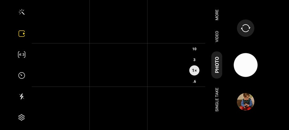
There are some small but important changes in the camera app as well. The non-descriptive pictograms indicating the level of camera zoom have been finally substituted for digits, which do a much better job at showing you the zoom level. 1, 3, and 10 are objectively way more descriptive than a bunch of trees, a large tree, or a larger tree.
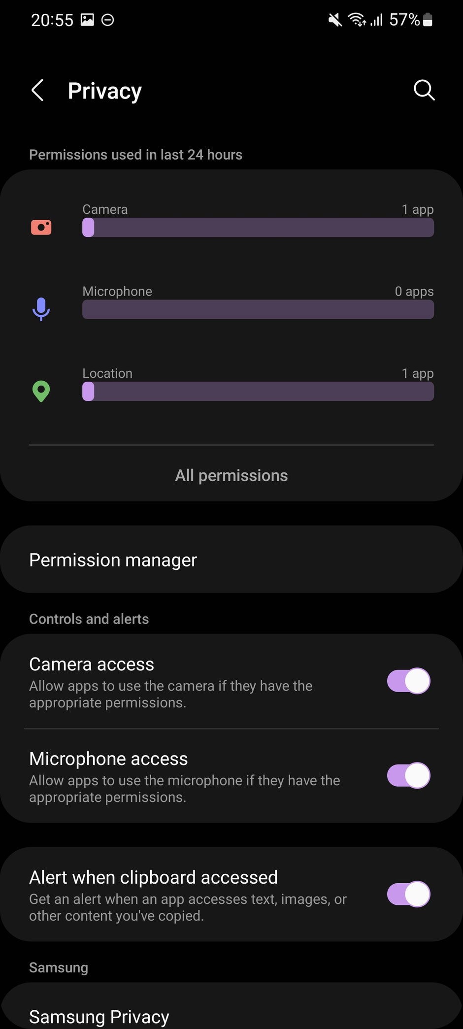
The majority of privacy features introduced with Android 12 are found in One UI 4 as well. When an app is using your microphone or camera, a green indicator will pop up in the upper right corner where the battery percentage usually resides. Approximate and precise location is also on deck, allowing you to fine-tune your privacy settings and only share your real location with apps you truly trust.
The new Privacy dashboard is possibly one of the best new features to come with One UI 4. It gives you truly detailed information about what permissions each app has been granted and for how long. The Privacy dashboard also lets you easily revoke permissions straightaway. But the best part is that everything is laid out so comprehensively that you don’t need extensive experience or knowledge to know what’s happening at any point.
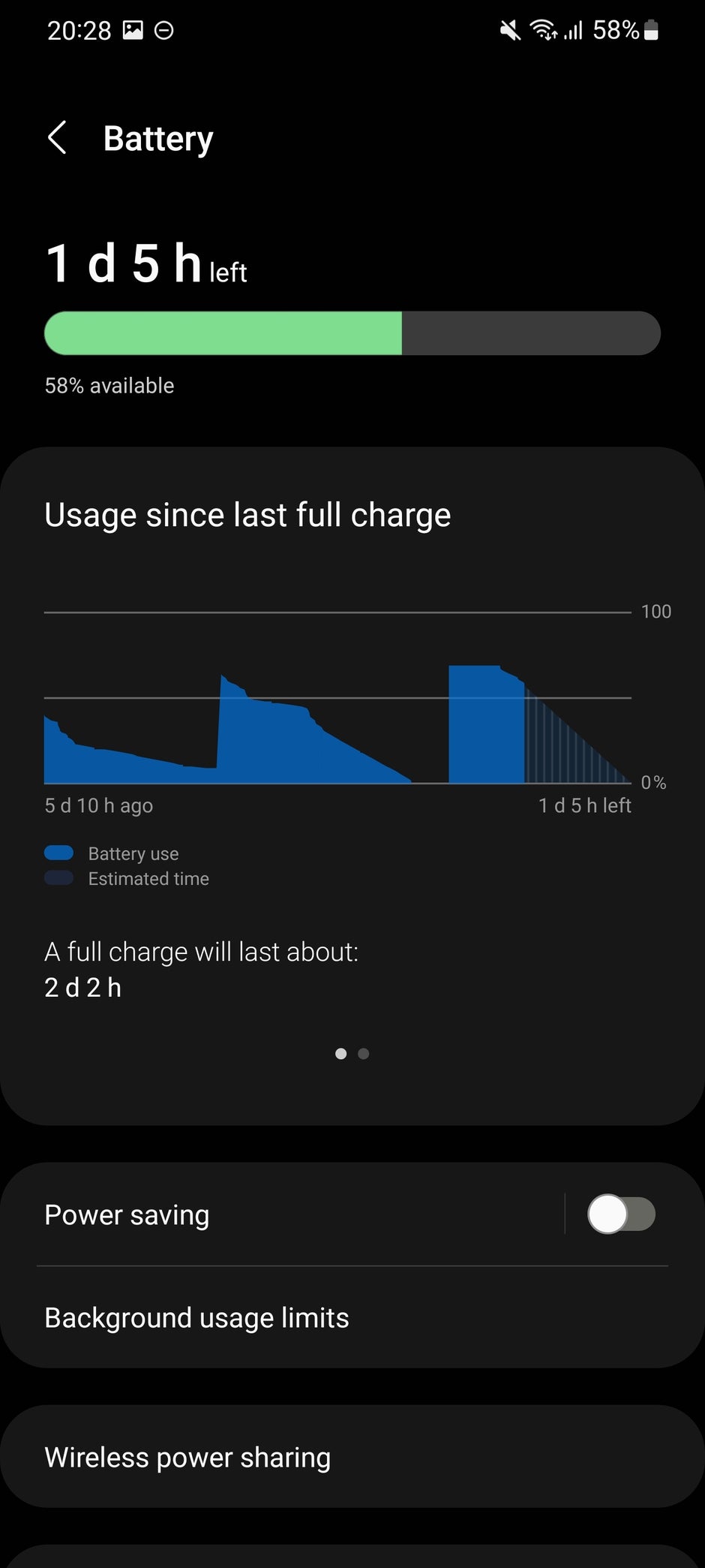
Samsung has also opted out of some slightly controversial and backward Android 12 changes that I applaud. Instead of the pretty limited battery stats we got in the new version of Android, which only show you the last day of usage, One UI 4 would show you detailed battery stats since the last full charge, giving you deeper insights over your usage.
One UI 4: Performance gains and stability
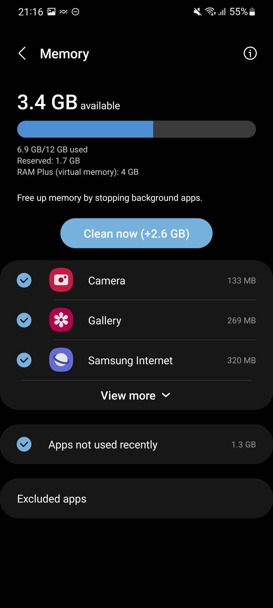
One of the major features that arrived for many top Samsung flagships with the One UI 4 update was RAM Plus, an especially useful feature that allocates 4GB of your storage as virtual memory and essentially boosts the multi-tasking capabilities. While this novelty will probably be treasured by the heaviest of power users out there, even regular Galaxy users should benefit from this feature.
One UI 4: Conclusion
One UI 4 is an excellent follow-up to the already superb One UI 3.1 and all the previous iterations as well. The secret? Change things a bit, but don’t change them too much while preserving system stability. While some may feel that One UI 4 is a rather boring update, and there certainly is some truth in that, I feel that One UI 4 is yet another successful iteration of Samsung’s software advancements. In any case, if you’ve been loving the whole idea behind One UI all these years, One UI 4 is certainly not going to disappoint you; on the contrary, it sprinkles just enough ‘life’ into the Samsung software ecosystem, truly elevating it as Android’s probably best custom interface around.